Signup & Onboarding Audit (Web)
Audited August 2026 via an automated browser walkthrough of thetrickbook.com/signup plus a code review of pages/signup.js, pages/login.js, and the next-auth config. The walkthrough filled the form with test data and stopped before creating an account.
TL;DR
The web signup is a 4-step wizard, and its single biggest problem is that the account isn't created until the final step. Every user who drops off at step 2, 3, or 4 leaves with no account — so we can't email them, re-engage them, or even count them as a signup. On top of that, social login is buried below four password fields, and the last step is a 16-field vanity form before the account exists.
Highest-leverage fixes: create the account at step 1 (email/social), lead with social auth, delete the confirm-password field, and move everything after "create account" into a skippable, non-blocking post-signup flow that lands the user on an activation moment (the spots map) rather than an empty profile.
Current flow
| Step | Screen | What it asks | Account exists? |
|---|---|---|---|
| 1 | Create Your Account | Name, Email, Password, Confirm Password — or Google / Apple (below the fold) | ❌ No |
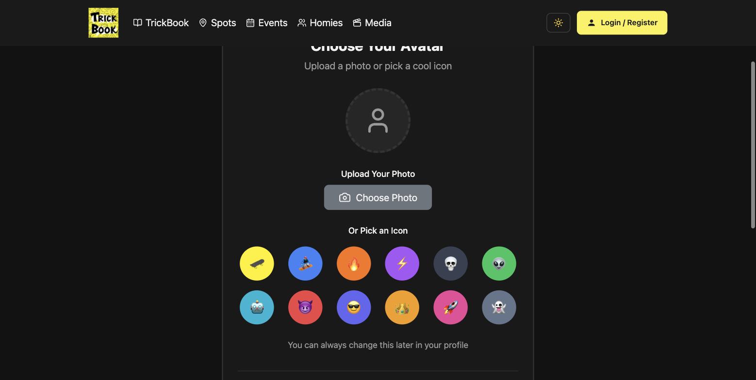
| 2 | Choose Your Avatar | Upload a photo, or pick 1 of 12 emoji icons | ❌ No |
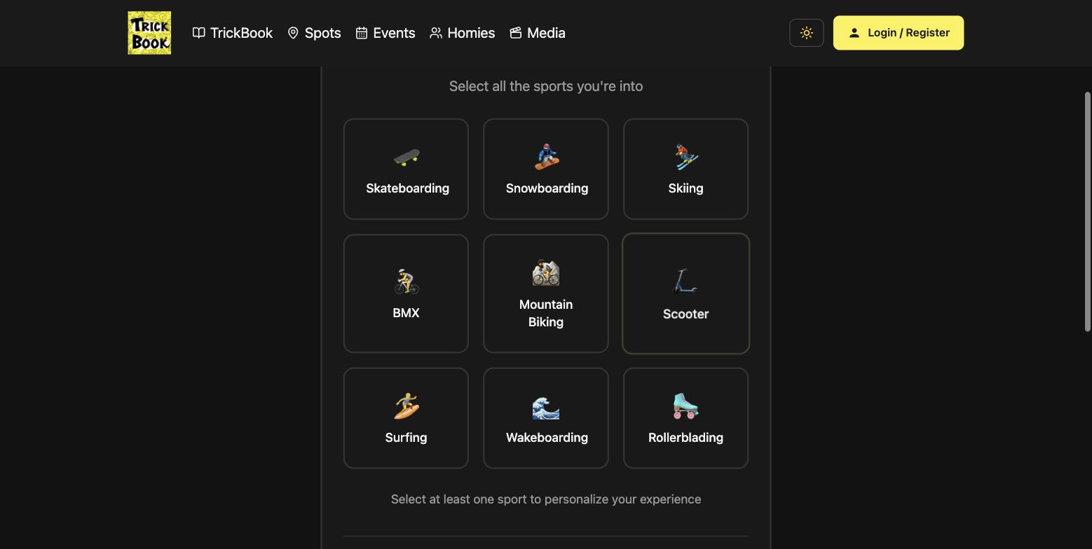
| 3 | What Do You Ride? | Multi-select from 9 sports | ❌ No |
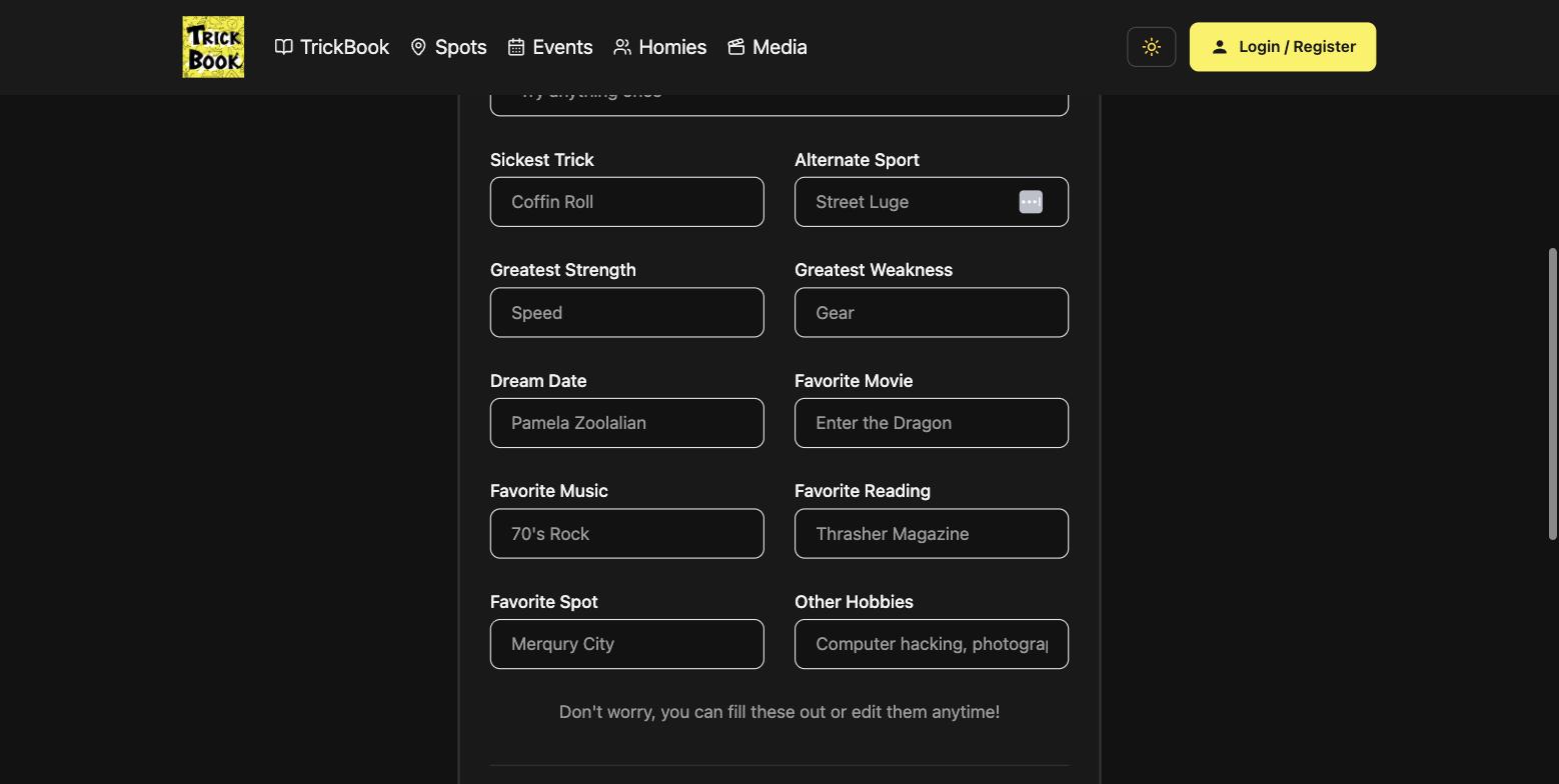
| 4 | Rider Profile | ~16 optional fields (nickname, style, age, motto, sickest trick, dream date, favorite movie/music/reading…) | ✅ Only on "Create My Account" |
After submit, the user is redirected to /profile (their empty profile).
Step 2 — Choose Your Avatar
Step 3 — What Do You Ride?
Step 4 — Rider Profile (16 fields, before the account exists)
Conversion problems (ranked)
- The account is created last. The wizard only calls the register endpoint on step 4's "Create My Account." Abandon at step 2–4 → no account, no email, no re-engagement, not counted. This is the #1 funnel leak. Create the account as early as possible (step 1); treat everything after as resumable onboarding.
- Social login is buried. Google / Apple sit below four password fields. Social auth is one tap, needs no password, and returns a verified email — it typically converts far better. Lead with "Continue with Google / Apple"; make email the secondary path.
- Confirm-password field. Adds friction and error states. Drop it in favor of a single password field with a show/hide toggle.
- A 16-field form gates account creation. Even labeled "optional but fun," step 4 reads as a wall of work, and the "Skip to finish" link is small and easy to miss. Move the rider card entirely post-signup (an in-profile "complete your rider card" prompt), and trim it — 16 vanity fields is over-scoped for onboarding.
- No value or proof before the ask.
/signupdrops straight into a form: no headline, no social proof (we have 4,900+ spots across 48 countries and real events to point at), no product preview. This is exactly where eliza.app's homepage wins — a benefit-led hero, visible social proof, and one clear CTA above the fold. Our signup has no motivation layer. - Lands on a dead end. Post-signup redirect to
/profileshows an empty profile. Land on an activation moment instead — the spots map centered on their location, "find riders near you," or "log your first trick." - Emoji avatars. 12 emoji "icons" as the avatar set reads low-fidelity for the brand (and cuts against the emoji-cleanup direction elsewhere). Prefer photo upload + generated/initials avatars.
Bugs found in the signup code
- Avatar photo upload is stubbed. The step-2 photo is never persisted — the code has
// This would need a separate endpoint - for now we'll handle it later. So a user who uploads a signup avatar loses it. (Related to the web-vs-app profile-picture precedence issue.)
Two things initially looked like bugs but check out on closer inspection:
NEXT_PUBLIC_BASE_URLin the register call — this env var is set and is used across the app (settings, profile, next-auth, payments) as the API host, so`${NEXT_PUBLIC_BASE_URL}/api/users`resolves correctly. It differs fromNEXT_PUBLIC_API_BASE_URL(which already includes/api).logIn(loginResult.token)—signIn('credentials')returns notoken, so that argument isundefined, butsignInsets the next-auth session cookie on success andAuthContextreads it, so login works. It was cleaned up (logIn(null, email)) rather than left relying on the redundant call.
Implemented from this audit
- Account created at step 1 ✅ — the single biggest fix. Step 1 now registers + logs in, then steps 2–4 become skippable post-signup profile setup (saved via
PUT /api/user/:id, best-effort). A drop-off during setup now still leaves a real, re-engageable account. "Skip for now" / "Finish" both save what's collected and land on/spots. - Social-first step 1 — "Continue with Google / Apple" now lead, above the email form.
- Single password field with a show/hide toggle (removed the confirm-password field + its error state).
- Activation landing — new users go to
/spots(the map) instead of an empty/profile. - Rider card trimmed ✅ — step 4 went from ~16 vanity fields to 4 high-signal ones (Nickname, Rider Style, Sickest Trick, Home Spot). The rest of the rider card is now filled progressively from the user's profile, so the last onboarding step no longer reads as a wall of work.
- Prominent signup CTA ✅ — logged-out users now see a subtle "Log in" link next to a prominent yellow "Sign up free" button (→
/signup) in the nav, instead of a single low-key "Login / Register" link. The primary conversion action is now obvious on every page.
Still open: add a value/proof hero to the signup page (headline + social proof above the form), and wire the avatar photo upload (still stubbed — the icon path works via riderProfile.avatarIcon).
Retention recommendations
- Activation-first onboarding. Guide the new user to exactly one meaningful action (save a spot, follow a homie, log a trick). First-action users retain dramatically better than passive signups.
- Progressive profiling. Collect the rider-card details over time via in-app prompts, never upfront.
- Use the sport selection. Personalize the first post-signup screen with their sports — spots filtered to their sports, events for their sports, riders who share them. Today the selection isn't obviously leveraged after signup.
- Lifecycle email. Because the account now exists early, send a welcome email with a clear next step, then day-1 / day-3 / day-7 nudges. (The backend already has a reminder/notification system to build on.)
- Network effects. Prompt "find your homies" / connect contacts early — social graph is the strongest retention lever for a community app.
- Habit loops. Trick-logging streaks and weekly session reminders (push infra already exists).
Recommended redesign
1. Signup page = value + social-first + minimal.
- Above the fold: a tight value prop + social proof ("4,900+ spots, real events, your crew"), then "Continue with Google" / "Continue with Apple" as the primary CTAs, with "Sign up with email" (email + one password w/ show-hide) as the secondary path.
- Create the account here.
2. Post-signup onboarding = 2 light, skippable, non-blocking steps.
- (1) Pick sports (personalization), (2) optional avatar. Everything else (the rider card) becomes an in-profile prompt.
3. Land on activation, not the profile.
- Send them to the spots map centered on their location (or "find riders near you") so they hit the aha and take a first action immediately.
4. Let people explore before committing.
- The map with thousands of spots and real events is the value — surface it pre-signup and gate only the save/follow actions behind account creation (which is now one tap).
North star: eliza.app's homepage converts because it shows value + social proof and offers a single, low-friction CTA above the fold. TrickBook has stronger raw proof (thousands of spots, real events) — we just need to show it before asking for a commitment, and make that commitment one tap.